Data visualization helps people understand the significance of data by placing it in a visual context:
how might it forward the efforts of a non-profit?
There’s an infinite number of ways data visualization could help non-profits’ causes.
Tableau, a leading data visualization tool, has a division that works exclusively with non-profits around the world as well as a social responsibility division that takes on causes. One example of a non-profit data visualization project is the end malaria campaign below.
http://datavizathon.com/PATH and the Tableau Foundation wondered how data visualization could help us see a world without malaria and END MALARIA.
Visualized data was used to both understand information and make decisions, for example where bed nets are lacking and where to deploy diagnostics.
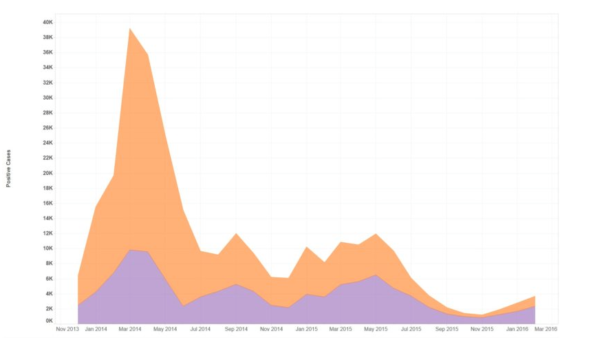
Right: This visualization shows malaria cases coming back between January and April (the rainy transmission season).
The height of the 2015 transmission season, when compared to other years, is significantly lower. The area in purple shows the percentage of cases detected by community health workers, which means detection and treatment cases closer to the places where they first emerge.


0 Response to "NOW - Through November 3rd: Kansas City's DATA VIZ-A-THON"
Post a Comment